

Foundation
"Finding the right property shouldn't be hard!"


Background
With real estate becoming one of the most popular and fastest growing investment options, average people are eager to jump into it. The problem lies with these new and enthusiastic people becoming easily overwhelmed and hesitant to jump into real estate investing. Foundation aims to help with this by being an intuitive, responsive, and uniquely tailored platform to provide the best information to those ready to make the jump.


Information Architecture
Once I thoroughly read through the project brief and requirements, I began working on my task analysis and user flows.
User Flows
Using quotes and project requirements from the user persona profile, I set up and laid out the flows for 3 tasks.

Task 1:
"As a user, I want to create a profile containing all my property criteria, so that I am recommended results most relevant to me."

Task 2:
"As a user, I want to be able to save or mark properties I am interested in, so that I can easily revisit them."

Task 3:
"As a user, I want to be able to contact the right people if I am interested in viewing a property, so that I schedule a viewing."

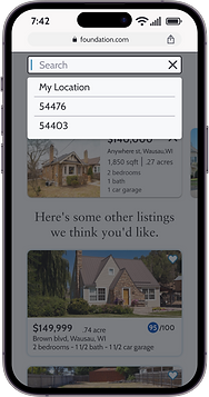
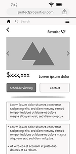
Wireframes
With my head now full of ideas, I began crafting low and mid-fidelity wireframes. The project began as Perfect Properties, but was renamed to Foundation later on.


Elements Organization
I made sure to logically label and name all the components, assets, and groups to make handoff to developers much easier.


UI Design
With the low-fi wireframes complete and assets organized, I began working on the design aspects starting with mood boards to help set the tone of the design.
Mood Boards
I compiled two mood boards following the project requirements of being clean, quick, and smart using blues, greens, and purples.
I chose to go with mood board B as the influence for the appearance of Foundation as it met the project requirements better and with a cleaner look.
Option A didn't appear as clean or quick to me and I felt the page backgrounds would need to be a shade of green and that the contrast and cleanliness would be muddled versus the off-white background used with the blue palette.


Typography
I deiced to use the typefaces of Cabin and Sabon Lt Pro over some others that are commonly used by bigger tech companies, to just be a little different, but still be easily read by users.
Cabin was suggested as an alternative to using the widely used Lato and Open Sans fonts with a slightly thicker stroke to provide improved readability on smaller screens.
Sabon Lt Pro is a serif type font that was suggested as a good pairing for Cabin and it even though being recommended as a body font, I felt it worked well for headlines to maintain readability while still have a visible difference over Cabin.

Color
Knowing I wanted to utilize a blue palette for a clean look, I began the arduous task of finding the right one. Sorting through numerous color palette generators and an absurd amount of palettes, I narrowed it down to three choices.
I decided on using palette 1, analogous blue, with palette 3 being a very close second.
Within palette 1, I decided to only use three of the five colors:
Primary color- #0818A8
Secondary color- #0045BF
Accent color- #0071B5


For the background, text and accent grays, the following were used:
-
Background/ white text color- #F7F8FA
-
Text black color- #1F1F26
-
Dark gray color- #292A30
-
Medium gray color- #676975
-
Light gray color- #8D8E9E
Hex: #F7F8FA
RGB: 247, 248, 250
Hex:#1F1F26
RGB: 31, 31, 38
Hex: #292A30
RGB: 41, 42, 48
Hex: #676975
RGB: 103, 105, 117
Hex: #8D8E9E
RGB: 141, 142, 158
Imagery
With my color palette decided on, I began searching for quality images that fit the brand and set a benchmark of content and quality for future imagery.
Non-branding images should be high-quality, focus mainly on the house or property, and be free of debris or clutter within the property area. Any realtor images need to be of professional quality and current.


Iconography
To follow the clean and quick appearance, icons needed to be simple and easily recognizable. A mix of Material Design and Apple's Interface guidelines were used as influence for the icon choices. It wasn't necessary with this being a responsive web app, but their guidelines off lots of insight for mobile screen content.

Animation
I added in various animations through XD and learned a lot about their auto-animate feature and was able to create an intriguing search bar animation.

Breakpoints
This was a mobile-first design project, but to add versatility, I made designs for both Tablet (834 x 1194px) and Desktop (1280 x 800px) to show the expected page adjustments for various screen sizes.
Mobile Grid Spacing: Columns: 4, Gutters: 20, Column width: 71, Margins: 35
Tablet Grid Spacing: Columns: 8, Gutters: 20, Column width: 78, Margins: 35
Desktop Grid Spacing: Columns: 12, Gutters: 20, Column width: 70, Margins: 110


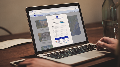
Final Mockups
With my overall design polished, I made mockups for visualization of the app in real world devices using Photoshop and Placeit.com.


During the entire project I kept all my assets well organized which made the style guide easy to compile. Previously I had just used PowerPoint for my style guides, but this time did it right in XD which made it much cleaner and easier to update as well as being able to have the sidebar navigation.
Assets and UI elements
All of my assets and UI elements are organized in a single file for easy hand off to developers.
Interactive Prototype
What's next...
Takeaways
This project was great for me to improve my UI skillsets which I felt were the area I was lacking in the most.
I really enjoyed designing the Foundation app even though I was intimidated early on by the graphic and UI aspects. I realized I was simply overthinking it and making it more daunting in my head than it really was. When I stepped back and looked at everything in a much more simple way, I was able to push forward and finish this project that I am very proud to call mine.
What's next...
Foundation was my project for the UI for UX specialization segment of the UX design bootcamp I was in. It was a great project and I had absolutely wonderful support from my mentor Chiara. I will still probably play more with Foundation as I hone my skills more to use it as a my main portfolio showcase. I've been able to learn quite a bit about Adobe XD and feel I have many more ideas for especially the animations.
Of course after this, I now begin my search for a new job in the UX field to fulfill my goal of getting out off of swing shift work and being at a Mill so I can enjoy more of life with my family.