
HomeXpert
A place for users to
"Get an Expert's Helping Hand"
Background
Problem Statment
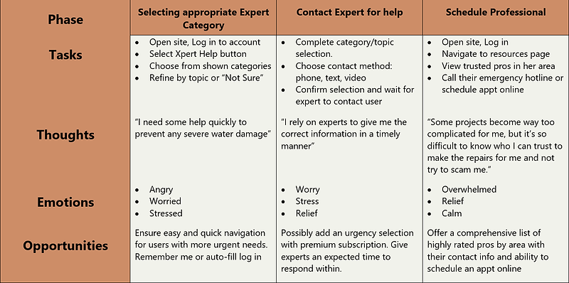
Our HomeXpert users need accurate information for performing household repairs and need somewhere they are able to ask experts any questions they may have regarding problems around their home including appliances, home repairs, and smart home technology because they need the correct information to fix their problems in the correct manner when they can’t find an answer anywhere else.
We will know this to be true when users create accounts and are contacting our experts and utilizing our how-to guides to solve their problems and find information.
Solution
Design an intuitive web app that offers users expedient navigation to the expert help area. The web app will also offer a comprehensive How-to guide area with an easy to use search option with specific functions reserved for users with accounts. For users wanting to utilize the expert chat feature, reasonably priced subscriptions will be offered as well as single use options.
Research and Analysis
Competitor Research
The 2 competitors I researched were 6ya.com and justanswer.com. Both were missing or lacking on many of the goals set for HomeXpert and I was able to find gaps that could be filled by HomeXpert.
Key Learnings
-
Competitors lacked easy access to quality How-to guides
-
Fast and easy navigation will be key
-
A mobile-first design is needed
-
User friendly pricing options and information


User Interviews
I conducted interviews with 3 participants, asking each a series of 16 open-ended questions to better understand how users with varying DIY skills locate information and where they turn if the project becomes too intensive for them to handle alone.
Key Takeaways
-
Options of methods for connecting with experts.
-
Easy options to search the how-to guides
-
Easy to follow navigation
-
Quick and easy access to all areas
Affinity Map
The information gathered from the user interviews was organized and used to form user personas.

Personas
From my research, two personas were created. Jon a 46 year old CPA who has enjoyed fixing things since he was a kid, and Maria who is a 24 year old Nurse who just bought her first house and even though she doesn't have much DIY experience, she is eager to learn.


User Journey- Jon
Having more experience with DIY projects, Jon's User Journey map was focused on him creating his account and primarily utilizing the How-to guide section and not requiring frequent use of the expert chat feature. The user journeys selected for him reflect this.
His persona type would be expected to use a more basic subscription and pay per use of the expert chat service.

User Journey- Maria
Maria is a new homeowner and doesn't have much DIY experience, requiring her to utilize the expert chat feature presumably more frequently to help in understanding parts and proper installation and functions. The user journeys selected for her reflect this.
Her persona would be expected to use the unlimited chat subscriptions in either a monthly or annual plan
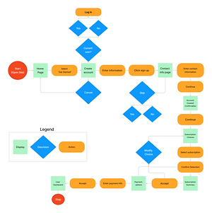
User Flows
3 primary flows were created based off the main features:
-
Create an account and select a subscription
-
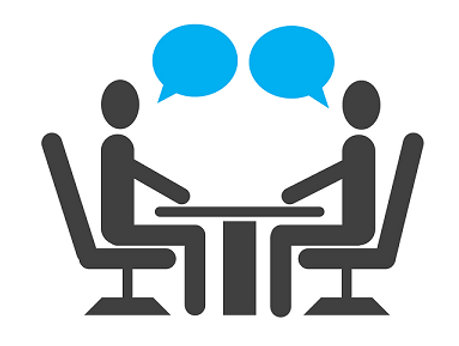
Contact an expert for help
-
View, search, and save a How-to guide


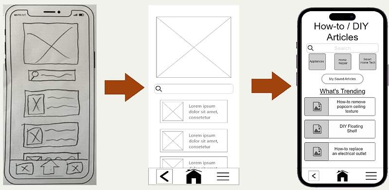
Wireframes
Wireframe Progression
I started with low-fidelity paper sketches to get an idea of the design and using Adobe XD, these were transformed into mid-fidelity wireframes and as prototyping began, into high-fidelity wireframes.
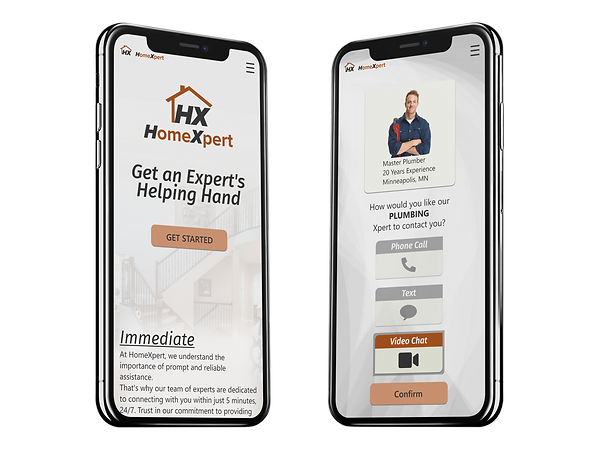
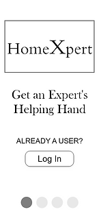
Log in / Create account
Users can log in or follow through a short tutorial before creating an account


Expert contact
Users select a category, narrow down to more specific topic, confirm their contact information, and finally choose how they want to be contacted
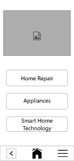


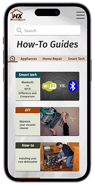
How-to guides
Users can search for specific articles, view the top guides or browse by category.


Usability Testing
Testing
Using the prototyping feature within Adobe XD, I created a fully-functioning, high-fidelity prototype of the complete web app. I recruited 6 participants to assist with usability testing. Each participant was randomly selected to start their set of 3 tasks using either the mobile or desktop version. Each participant was able to point out changes that were needed with 3 being high-level and 4 low-level.

Testing Results
3 High-level issues were identified:
Problem 1: Saving a how-to article wasn't a clear process.
Evidence: Every participant noted some level of difficulty with this task and either struggled for a bit, or took a guess.
Suggested solution: Add context to plus sign on mobile or change to a cleaner look.
Enacted solution: After 4 design iterations, it was ultimately decided to remove the save button from the list and move it to the top of the article after they open it. This encouraged users to view the article and not blindly save it.
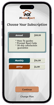
Problem 2: Wording for the subscription options was confusing.
Evidence: The majority of users did not fully understand the differences between options and needed further explanation of the choices.
Suggested solution: Change wording of subscription choices to present more clear options.
Enacted solution: Many iterations were required to get this section to an ideal state which ended up with rewording the subscription for occasional use to the DIY'er and the option for adding individual expert calls as needed.
Problem 3: Verify info page wasn't understood correctly.
Evidence: Roughly half of the participants went through the page quickly without reading the heading and thought it was the contact information for the expert not verifying their own information.
Suggested solution: Change wording and hierarchy of information on page for clearer purpose statement.
Enacted solution: Removed page as proper order of task flow wasn't very clear. Made a page under account settings for adjusting contact information and users who skipped that part during sign up will be prompted to enter that information before proceeding to the expert call.

UI Design
UI Design
After resolving my usability issues, I moved on to polishing the visual design in XD. The original visual design was very boring, needed a more appealing font throughout, used way too much heavy shadowing and overall lacked color. I stuck with a more modern industrial type look that I felt fit the brand the best, while adding a small splash of color. I mostly followed Material Design Guidelines along with influence from examples found online.
The primary design was done for mobile, but a few pages were created for a desktop size screen.
I feel the final design echoes the overall input i received from user interviews and the personas that were created. The primary goal of having easy navigation is shown throughout with the contrasting CTAs and selection card choices, all of which utilize easily understood and visible language usage.


Design Deliverables
All the assets used for HomeXpert were organized by folder into a single file along with the design documentation and design language systems. Icons, Images, and the Logo are all saved in PDF, PNG, and SVG formats. All items in PNG format are saved as 1x, 2x, and 3x sizing.
This is the final prototype of the project. Some features may not function yet. Will update as time permits.
What's Next
Next steps
The HomeXpert app can still use improvement in overall aesthetics. Though many changes have been made to make it look better, there is still sizing and language that can be adjusted for it to be cleaner, more current, and improve how the information is presented.
I would have loved to add full features along with complete examples for the how-to guides, but with time constraints, the project had to be condensed to have the main user flows functional.
For the team that I would hand this off to, I would ask to be kept in the loop if possible to assist with any questions or unnoticed design errors and that with any changes, they keep the heart of the design in mind.
Learning
The entire UX design process was new to me, so each step taught me new skills and forced me to step out of my comfort zone. I learned programs like Figma, FigJam and Adobe XD through simply using them, but I wish that I had more time early on to learn more of their features which would have saved me time throughout the project.
This being my first real start to finish UX design project, it really helped me to notice the aspects of UX in everyday life and potential frustrations on existing websites or apps.
Throughout this project as I researched and looked for inspiration for my design, I learned that I wanted to become the designer that improved ease of navigation and the presentation of information. Users, including myself, are so quick to leave a website within seconds because they don't see the information they need immediately.